

Whether you're updating your decline curves, forecasting wells for reserves, or evaluating an asset for acquisition, Petro.ai can fast-track your forecast workflow with fast and accurate decline curves, allowing you to quickly generate editable single-well forecasts, curate type curve groups, generate probabilistic type curves and more. Petro.ai utilizes sophisticated machine learning algorithms to optimize decline curves fits for unconventional oil and gas wells, while honoring engineering DCA models such as the Modified Arps equations. Let’s dive into the details…
Single-well PDP forecasts start with a Forecast Scenario. A Forecast Scenario can be used to organize decline curve models by area of interest, input assumptions (e.g. a specific b factor range), engineering team, landing zone, acquisition target…. the list goes on. You have the freedom to build the scenario with any way you see fit. The number of wells and speed at which they will forecast depends on the hardware of the Petro.ai server, but you should be able to comfortably decline thousands of wells in minutes.
The inputs to a Forecast Scenario can we well groups, type curves, and even other forecast scenarios for comparison (e.g. 2020 vs 2019 forecast comparison). In this blog we’ll focus on creating decline curves for existing, producing (PDP) wells.
Create a new Forecast Scenario
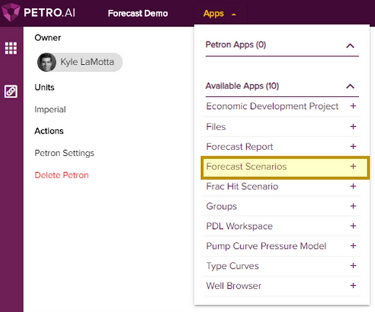
Apps in Petro.ai live inside of Petrons - think of a Petron as your digital workspace for organizing data and analyses. Start by creating a new Petron or opening an existing one. Inside your Petron, use the Apps navigation in the top toolbar to select ‘Forecast Scenarios’
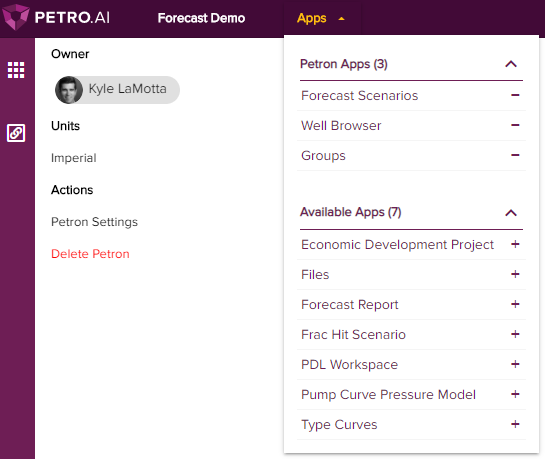
You can pin the app to your Petron for quick access by clicking the plus icon. I’ve also pinned the Well Browser and Groups apps:
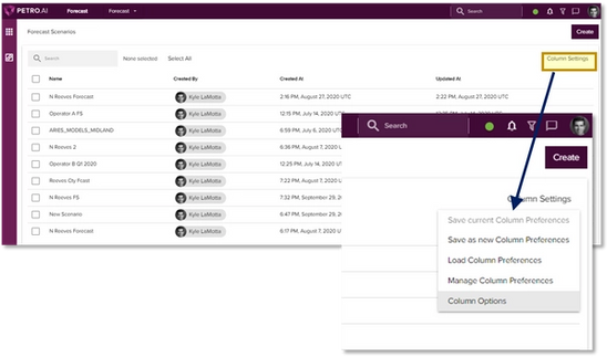
The Forecast Scenarios page shows all the scenarios saved in your Petron. Use the Column Settings > Column Options, located in the upper right portion of the table, to adjust the fields shown in the table, such as Name, Created By, Updated At, etc. If you’re working in a new Petron, this table will be empty.
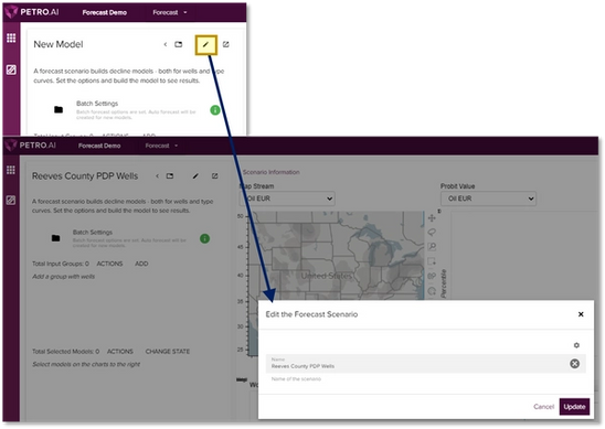
To start a new forecast scenario, click the Create button in the upper right corner. This takes you to the Forecast Scenario dashboard, which you’ll notice is empty until we populate it with wells. Let’s start by naming our forecast scenario using the pencil icon in the settings panel. Type a name in the box and hit Update.
Adding Wells and Auto-forecasting
Now let’s add some wells to forecast. Wells are added to the scenario using groups. Wells can be curated and added to groups from many of the apps, such as the Well Browser map or pasted from a list of well IDs in the Groups app. I’ve created 2 well groups to use for this demo:
- North Reeves – Wolfcamp: 245 wells in Reeves county landed in the Wolfcamp
- Reeves – Bone Spring: 42 wells in Reeves county landed in the Bone Spring
To add the groups to the scenario, click Add in the settings panel on the left side of the page. This brings up the Groups Select dialogue box – here you can search for a group (I’ve typed ‘Reeves’ to find my groups) or choose from your favorites (visit the Groups app to add favorites). Simply click the group to add it to your scenario.
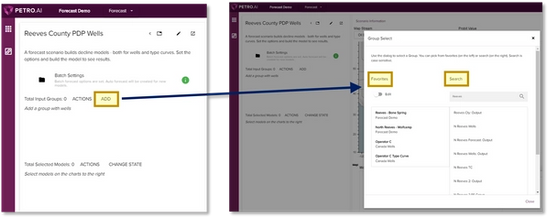
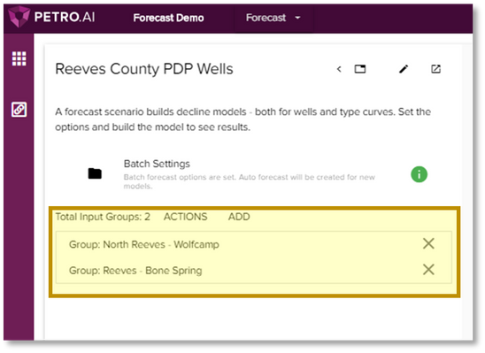
Repeat the steps above to add additional groups. Below we can see the 2 groups appearing in the left settings panel:
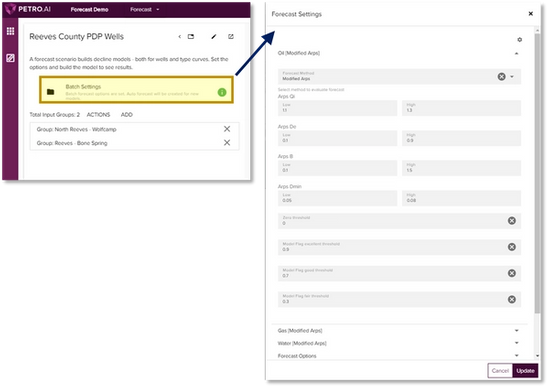
Now that we’ve added wells, the next step is to review and adjust the auto-forecast settings. To do this, click the Batch Settings button. The pop-up dialogue box lets you adjust settings such as forecast method, parameter ranges for each fluid stream, forecast duration and end of life options, and date normalization. In the screenshot below I’ve expanded the Oil section. The input boxes allow you to adjust the upper and lower limits for each parameter. The auto-forecast algorithm will use these values as “bookends” for each well’s DCA Equation. For example, if you don’t want the b factor to exceed 1.0, type this in to the ‘High’ input box in the ‘Arps B’ section.
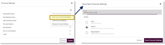
The auto-forecast settings can be saved for future use by clicking the gear icon in the upper right corner. In the example below I’ve saved these settings as ‘Delaware Basin DCA’ to the Petron, which means any other forecast scenarios created in the Petron will be able to load these settings. I could have also saved the settings to the organization to make the DCA parameters globally available to others, or to my user profile.
After configuring and saving the Forecast Settings, we’re ready to kick-off the forecast. Simply click ‘Build’ in the bottom right corner of the settings window. This brings up a confirmation dialogue summarizing the scenario – click Build again and watch the magic happen! The charts in the dashboard will automatically update as the decline curves are generated, and you can keep track of job progress in the upper right corner.
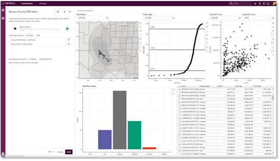
The Forecasts Scenario dashboard provides an interactive set of charts to review the forecast results. The charts are linked to each other, which means wells selected on one chart will be selected on the others. For example, try selecting the P50 wells on the probit to see where these wells are located on the map.
Here’s an overview of the dashboard, from top left to bottom right:
- Map showing well surface locations, sized by EUR
- Cumulative probability (probit) plot – use the dropdowns to change plotted variable
- Scatter plot with customizable X & Y axes (e.g. EUR vs Lateral Length)
- Workflow state summary – designates whether wells are queued for forecasting (initial), auto-forecast, working (manually edited), in review, approved or rejected. Use the actions for selected wells to change the state.
- Table summarizing EUR of each fluid stream for each well
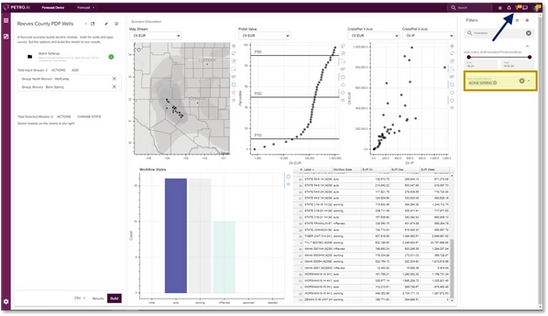
The dashboard will show all wells in the forecast scenario, but you can filter the data shown using the Filters panel, located in the upper right corner. In the screenshot below, I’ve filtered to wells in this scenario landed in the Bone Spring formation. Use the search field to find filters by keyword.
View and Edit Decline Curves
We plan to cover this topic in more detail in the future but want to make sure you leave this post knowing how to view and edit the decline curves that were generated in your forecast scenario. Start by selecting a well or group of wells on one of the visualizations. The selected wells appear in the Total Selected Models section in the left side panel. Then tap the Actions button or arrows to launch the Action Select modal. Then click ‘Edit Decline Curve Model’.
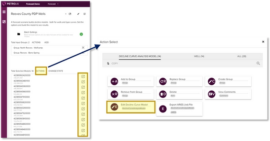
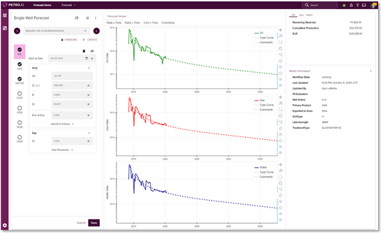
This action launches a new page where you can view and edit the decline curves for each well individually:
Summary
Here’s a quick summary of the steps to build a forecast scenario:
- Create or open a Petron
- Navigate to the Forecast Scenario app (or launch the action from the Groups app)
- Give your scenario a name, add well groups, adjust the auto-forecast settings, click Build
- Review forecast results in the dashboard
- Select wells from any of the visualizations, use the actions to edit individual decline curve models
Send us an email us with any questions or feedback: support@petro.ai


